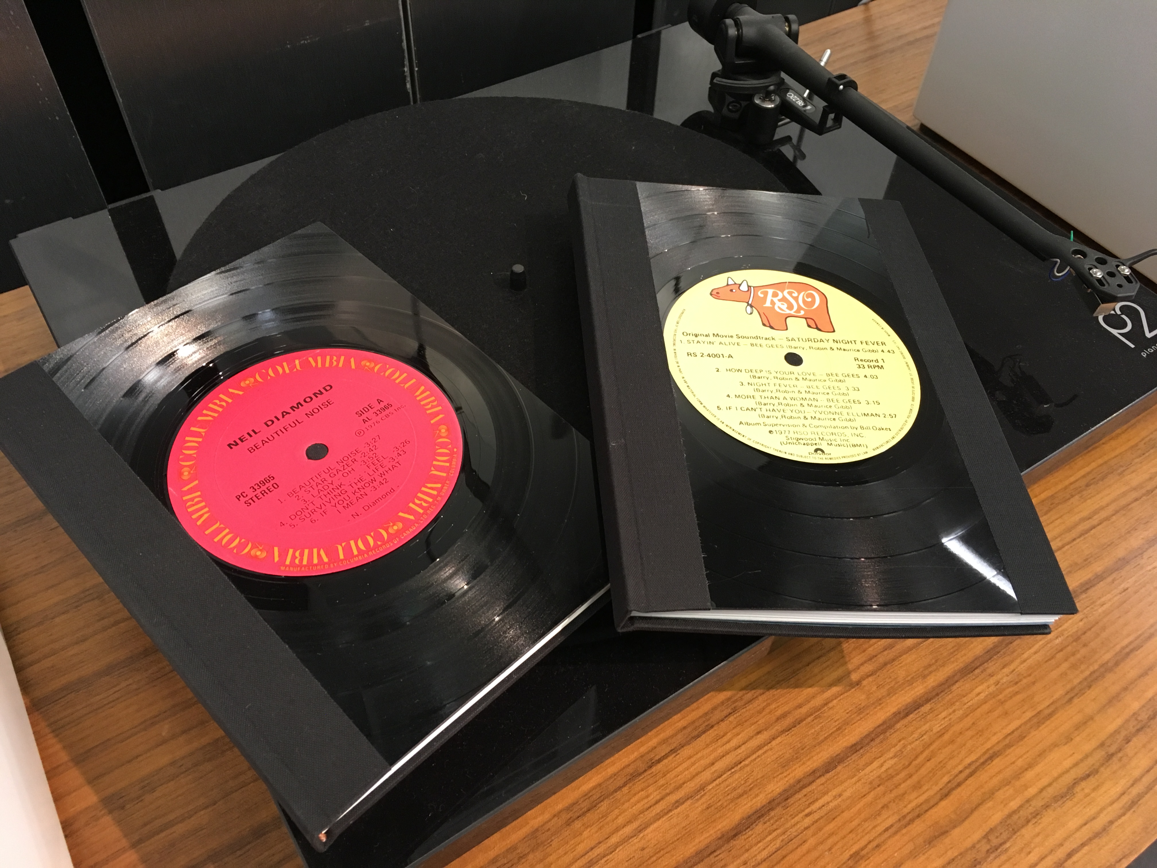
sometimes i like to experiment with binding materials and structures that may appeal to different audiences than some of my other pieces.
record/record and album/album
to those of us children of the 70s, the lp was an iconic item: a conflation of sensory manipulation. handling cash to purchase the latest release; feeling it in your hands on the way home; removing the cellophane wrapping; visually appealing album covers with their vivid graphic design and typography; inner sleeves printed with lyrics, liner notes and images; the feel of the ridges in the vinyl album itself; the light touch to manually move the arm with the needle and place it just so; the resonance of the literal grooves of music through the stereo speakers. (digital just doesn’t cut it – there’s no tactile experience to creating a spotify playlist.)
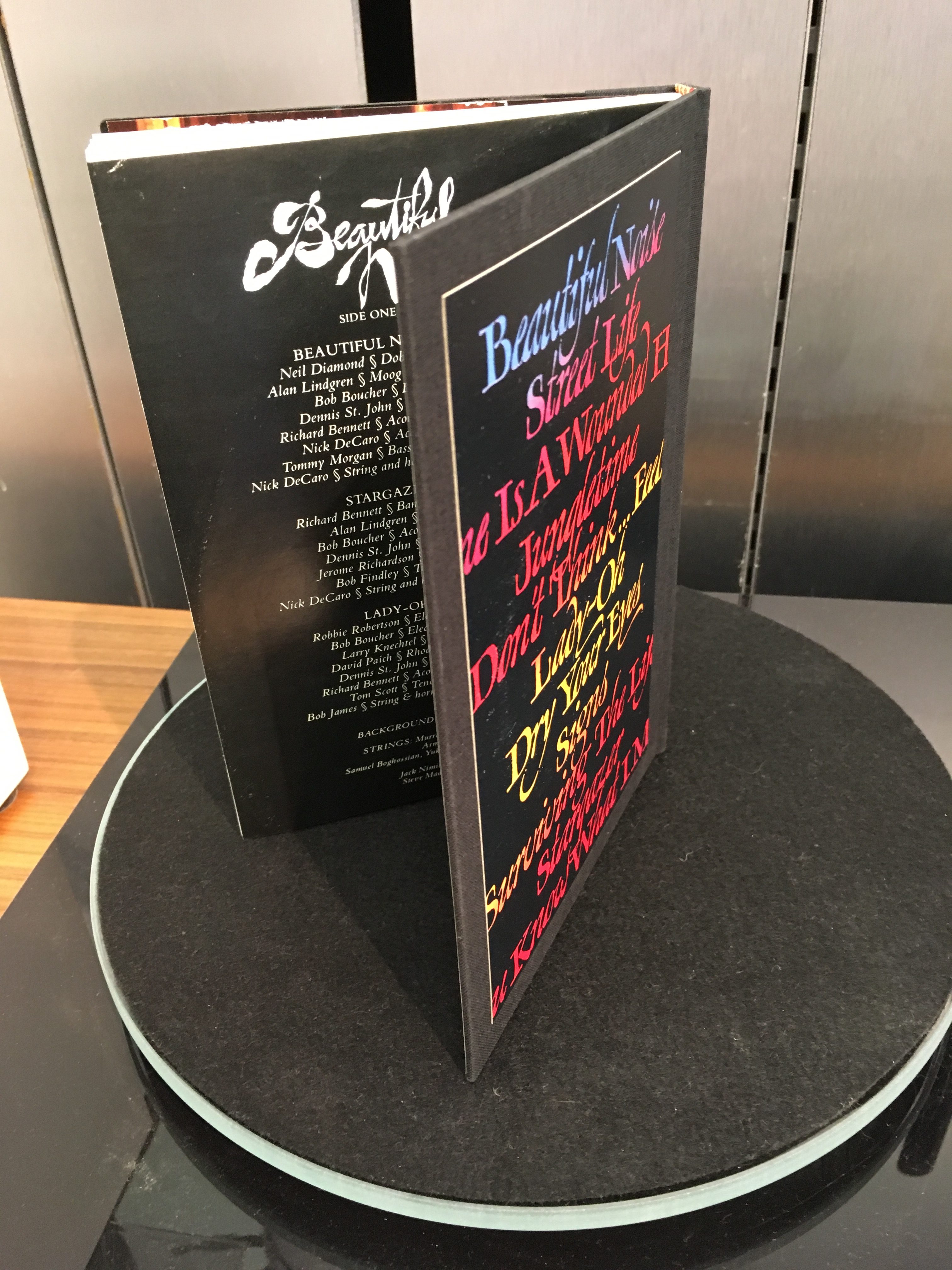
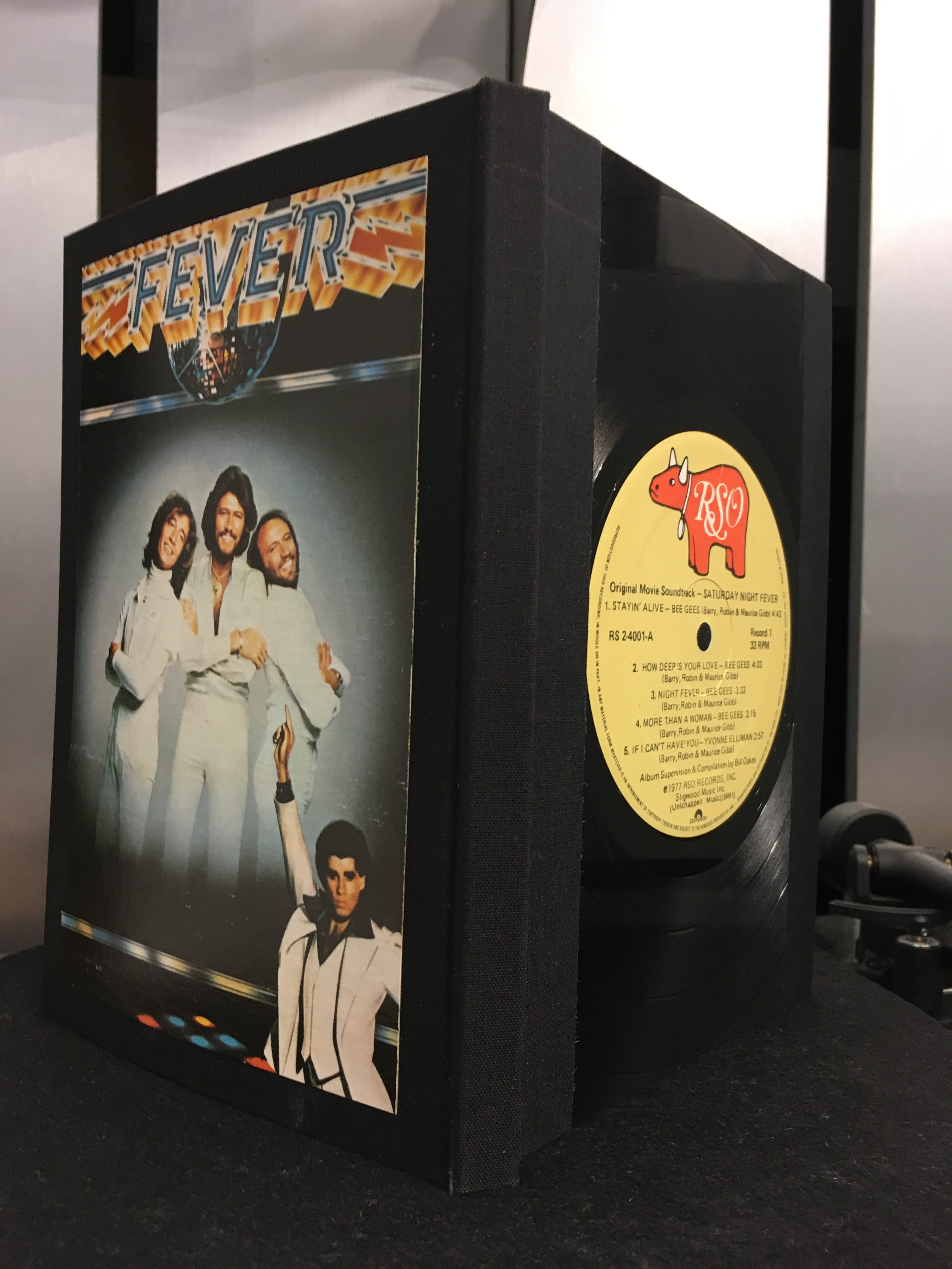
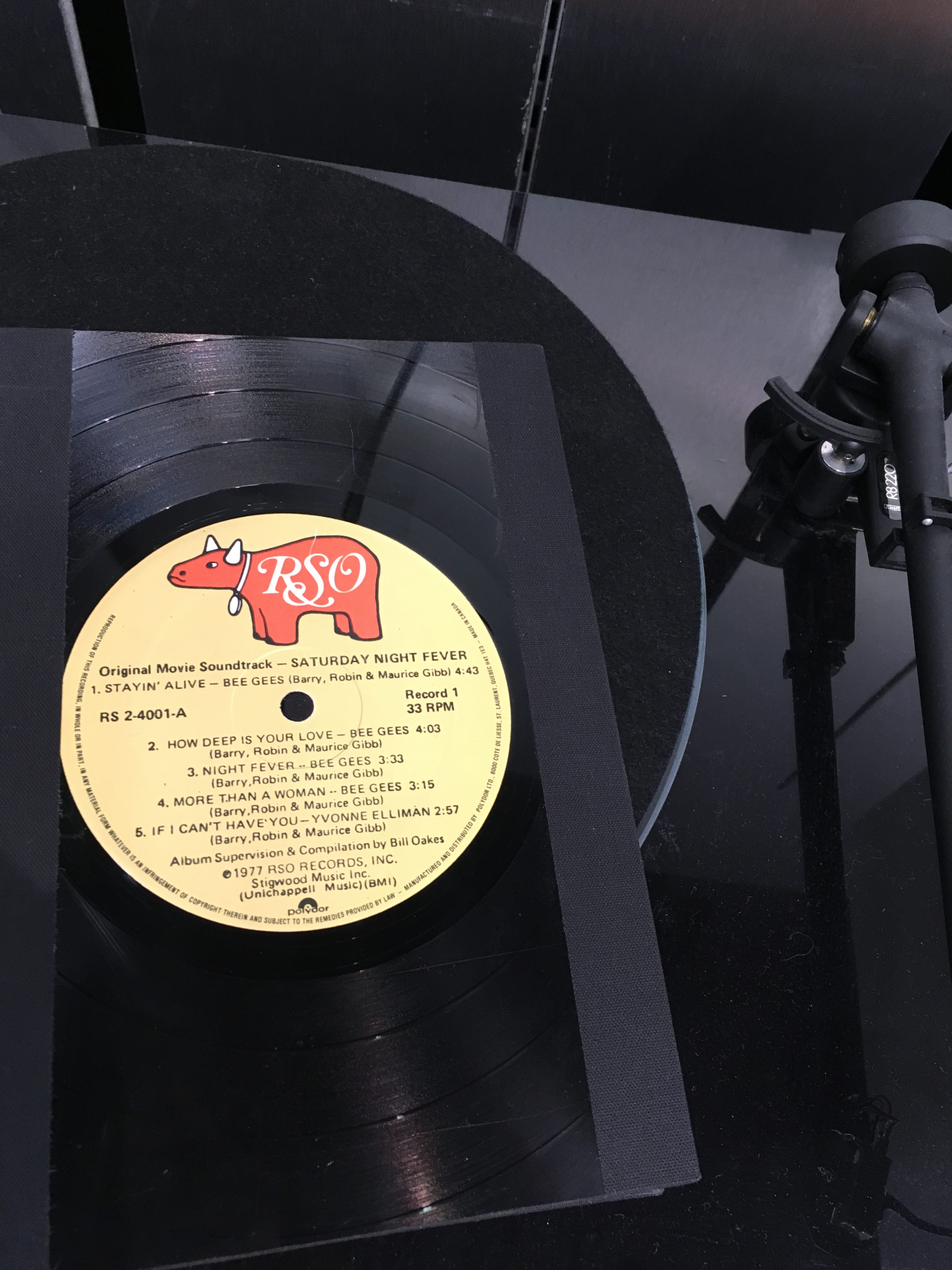
this is my inspiration for the record/record (portrait format) and the album/album (landscape format). i scavenge through second-hand shops to find lps that strike my fancy. the vinyl itself forms the front cover of the book, and the back is cloth-covered board inset with a piece of the album cover; where possible, the album sleeve is re-purposed for the endpapers.
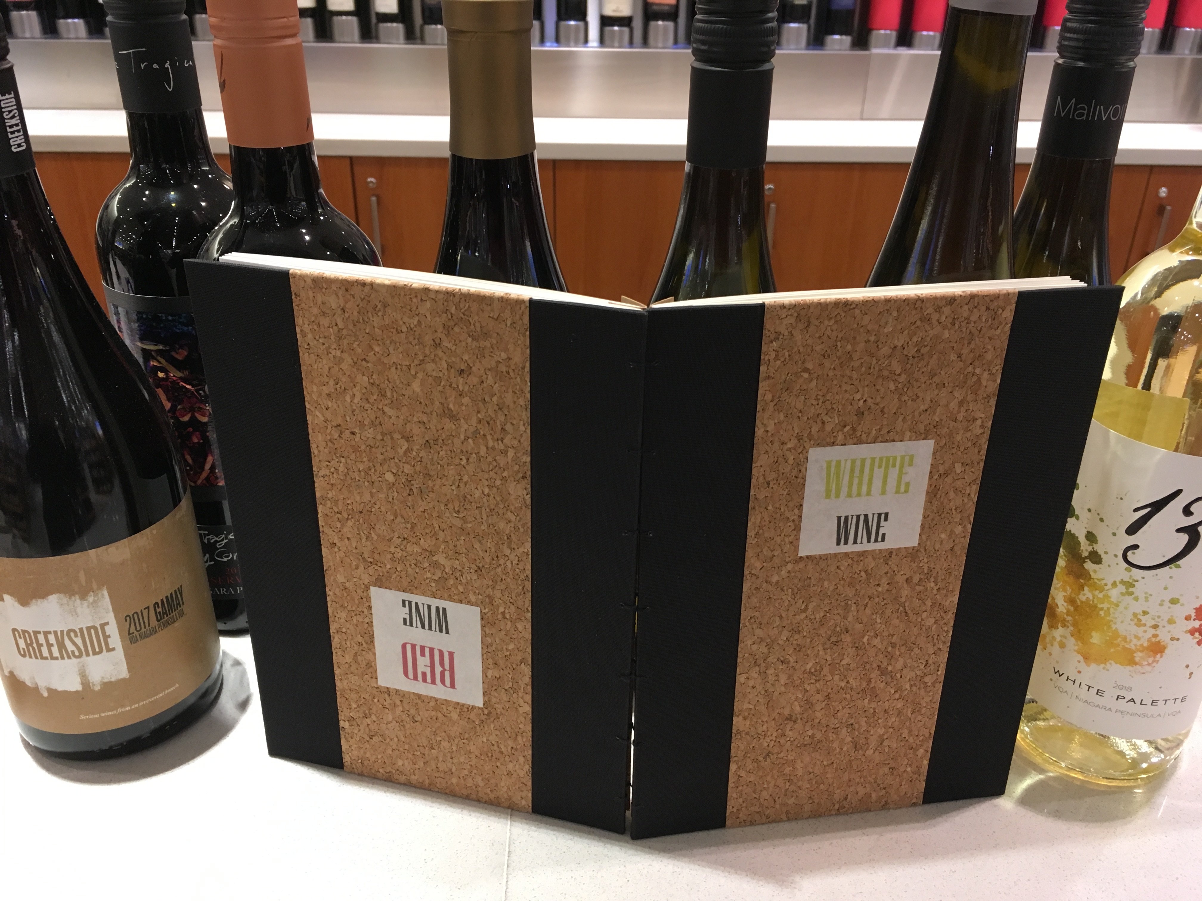
tipsy wine journal
i have many friends who are rather keen wine enthusiasts. (indeed, i have been known to enjoy the odd tipple myself!) sometimes you want to keep notes on whites, other times it’s all about the reds. this journal lets you do both!
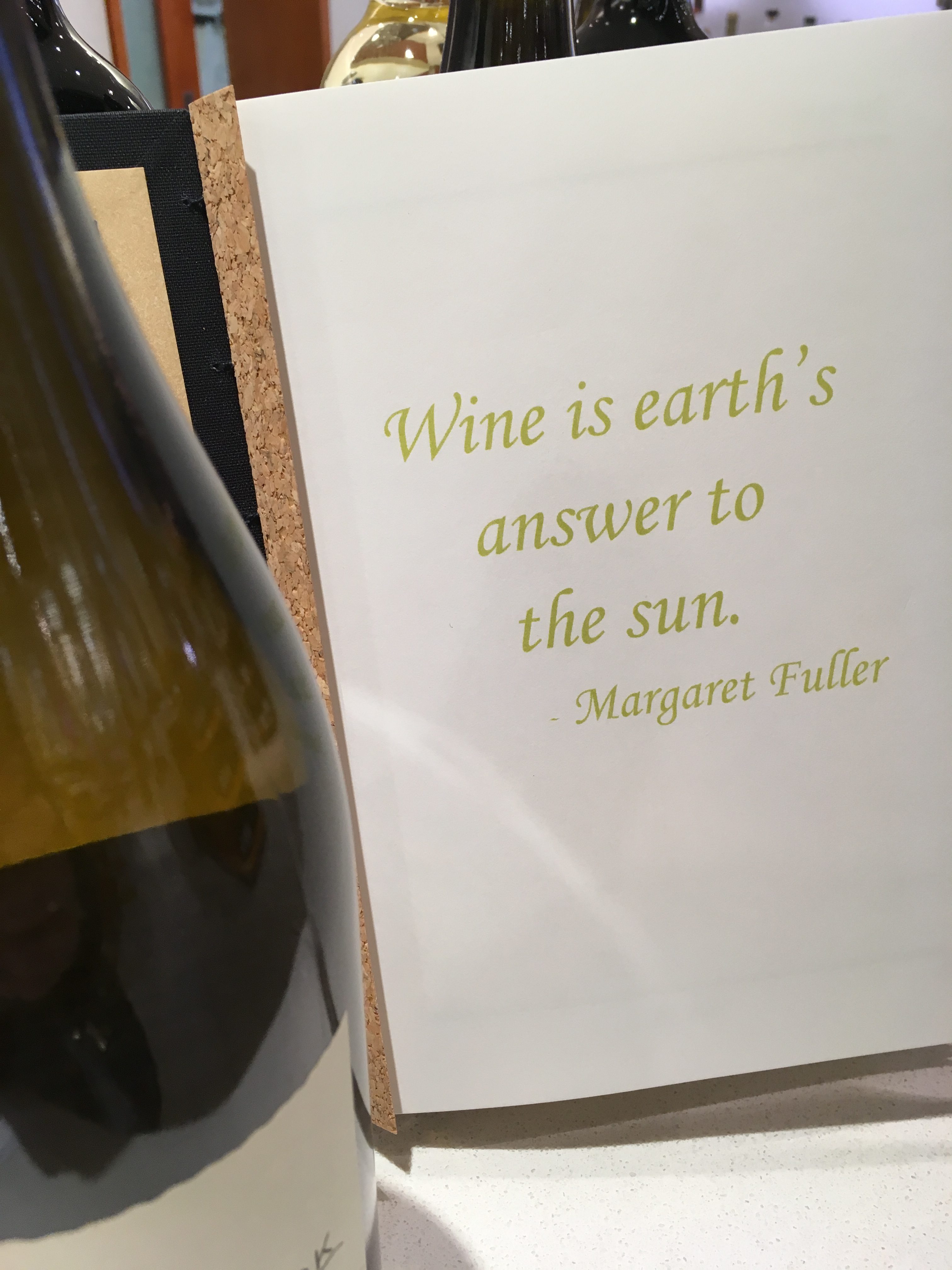
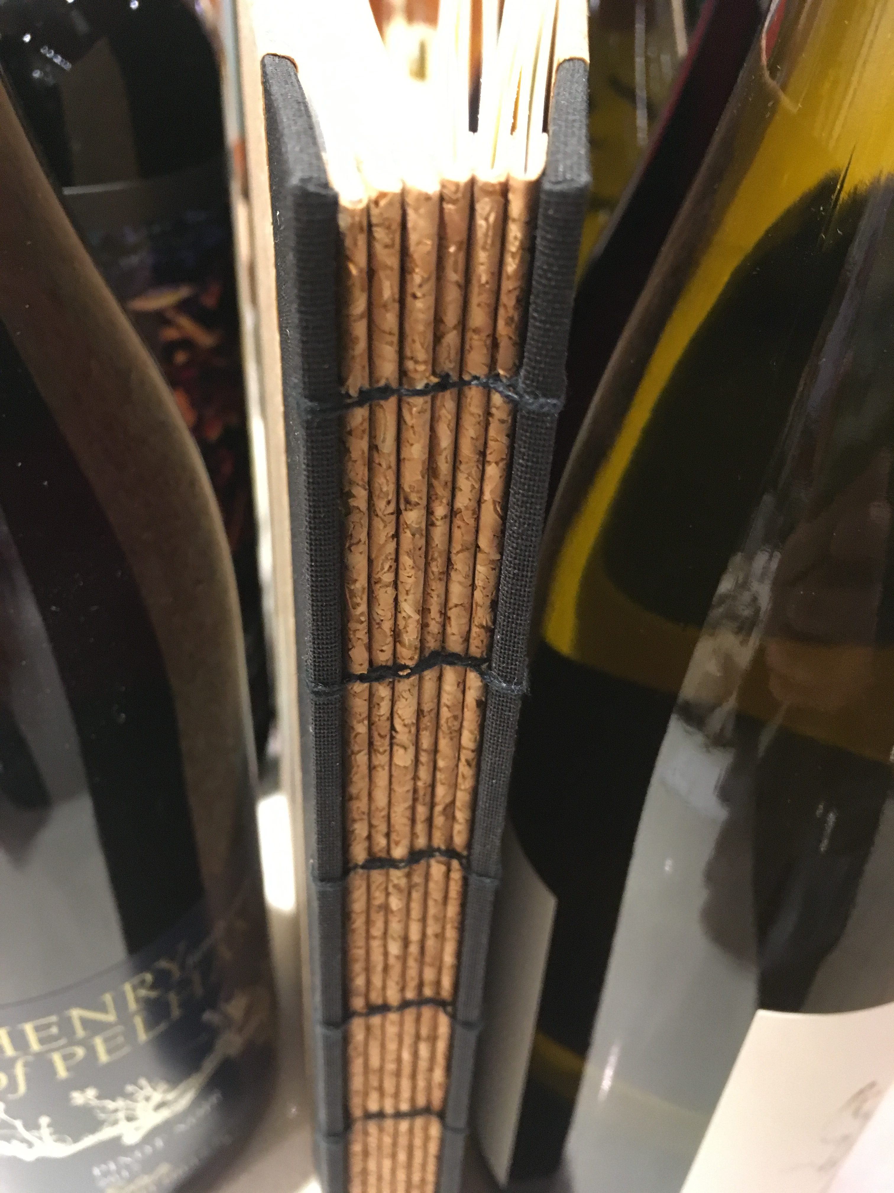
one cover and the first half of the signatures are dedicated to white wines. but flip the book on its head, and the other cover and signatures are for red wines. hence, tipsy! the book is a coptic stitch journal, but each signature is wrapped with a cork paper guard – this reinforces the strength of the spine, but also provides space within the book to insert items such as bottle labels or business cards from wineries or merchants.
